For the first time since the Reverse Retro and Reverse Retro 2.0 saga, all 32 National Hockey League teams are getting a new jersey as part of a league-wide, Fanatics co-created Hometown Remix series.
For some teams, this adds a third jersey to their rotation. For others, the Hometown Remix jersey will become a fourth or fifth set in their rotation for the 2026-27 season.
The Colorado Avalanche (Winter Classic), Carolina Hurricanes (Whalers throwback), Dallas Stars (Stadium Series), St. Louis Blues (90s era throwback), Vegas Golden Knights (Stadium Series) and Winnipeg Jets (Heritage Classic) will all fall into the latter category as they wear some combination of five different uniforms this season.
How many jerseys are too many jerseys, you ask?
As long as fans are willing to pay. You can skip groceries this week.
Now, the sports traditionalist in me believes there really should be a cap on things. In a perfect world, every team gets the option of wearing up to four jerseys in a given season– home, road, alternate and throwback.
The NHL sees the success of the NBA’s implementation of a four-jersey rotation (or however many they’re up to nowadays) and teams are more than happy to capitalize on nostalgia as a selling point in rebrands.
Why not make it such that throwbacks become incorporated in the regular routine up to four times a season?
Plus, in this perfect world, you’d only be allowed to wear a throwback uniform provided you are not participating in a marquee event that season, such as the Heritage Classic, Winter Classic or Stadium Series.
If you’re in one of those games, your throwback is on hiatus for a year or going back into the vault to be replaced with a brand new (er, old) throwback the following season.
But anyway, how are this year’s batch of Hometown Remix jerseys looking?
Overall, jersey aesthetics are a delicate balance of commercialization, creativity, nostalgia and pushing the brand forward.
The full set of Hometown Remix jerseys do just that.
Anaheim Ducks
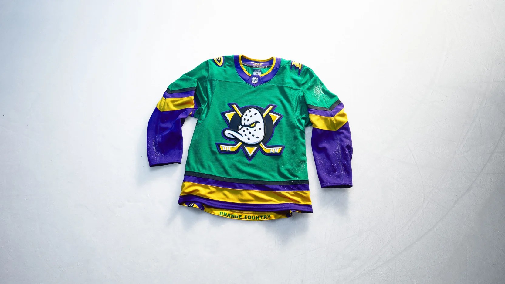
Let me start by making a lot of you (O.K., all of you) mad by saying I can’t stand The Mighty Ducks. I hate those movies with a burning passion.
That said, I grew up liking the overall look of the team formerly known as the Mighty Ducks of Anaheim before Disney sold the team and the Samueli family rebranded the organization as the Anaheim Ducks. Plus I liked Paul Kariya, Scott Niedermayer and Jean-Sébastien Giguère back in the day.
The merger of the current branding and the colors from the movie that gave birth to the NHL team is perfect for anyone that grew up in the 1990s and has never aged past that decade.
Fine, whatever.
Leo Carlsson is going to look like a million bucks in this– $18 million per year, as a matter of fact.
Effort: 8.0
Creativity: 2.0
Nostalgia: 9.3
Remix: 10.0
Total Score: 29.3
Boston Bruins
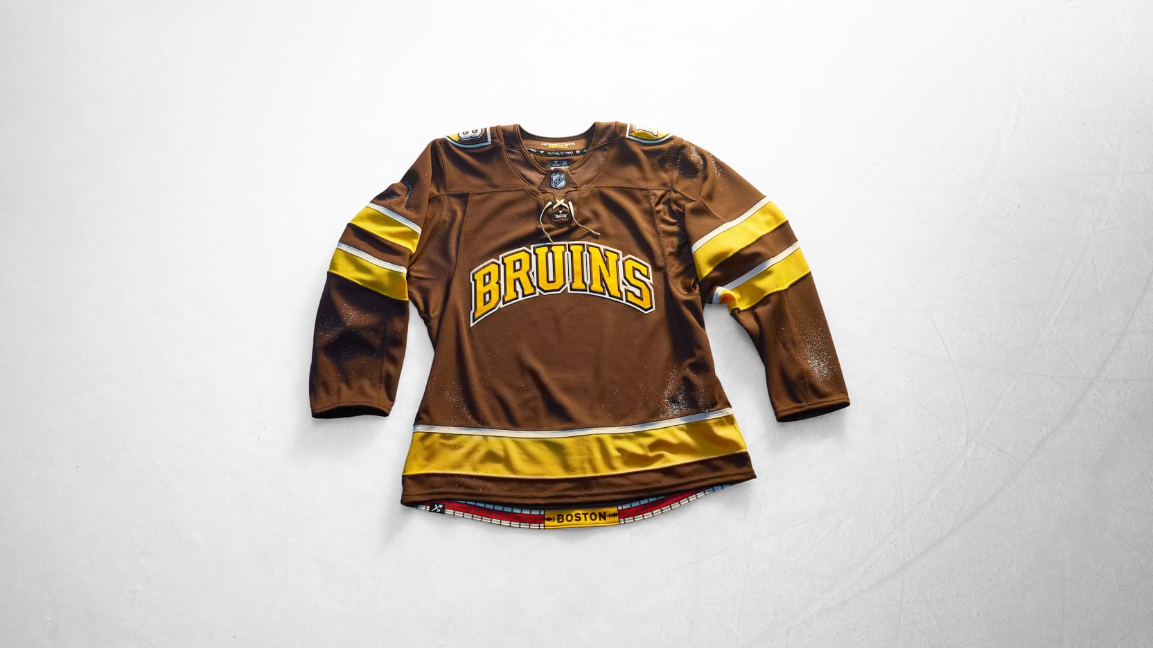
For the first time since their inaugural season in 1924-25, the Boston Bruins are wearing a jersey that is primarily brown. That’s right, folks, the original colors of the franchise reflected that of both Charles Adams’ grocery store chain and the animal that the team was named after.
I have waited my entire life for a moment like this.
Except there’s no bruin to be found, save for the “Bruins” wordmark on the front.
In lieu of Boston’s 2026 Stadium Series threads, 2023 Winter Classic jersey, 2016 Winter Classic jersey and 2008-16 alternate jersey, the bear motif with “Boston” or “Bruins” perched on top is probably tired and, thus, hibernating for the time being.
Instead, we get an element that hasn’t been seen on a Bruins jersey since 1945– numbers on the front!
Oh and gold helmets for the first time in franchise history too.
The ode to Boston’s numerous colleges and universities, as well as the touch of The Freedom Trail bricks in the hem make this jersey the hottest fashion piece inside any Dunkin’ from Huntington Ave to Comm Ave to Causeway Street.
I was fearful when we heard rumors and saw mockups and still wish that a bear made an appearance somewhere, but if this jersey had the shield logo as its crest it would’ve stuck out worse than any of the create-a-team logos in the EA Sports video games.
I actually like that it says “Bruins” instead of “Boston” but that stems from my original fear of the overall aesthetic— if I wanted a sweater that said the city name, I’d just buy one from one of the many Faneuil Hall vendors like a tourist.
Effort: 8.8
Creativity: 7.3
Nostalgia: 10.0
Remix: 9.9
Total Score: 36.0
Buffalo Sabres
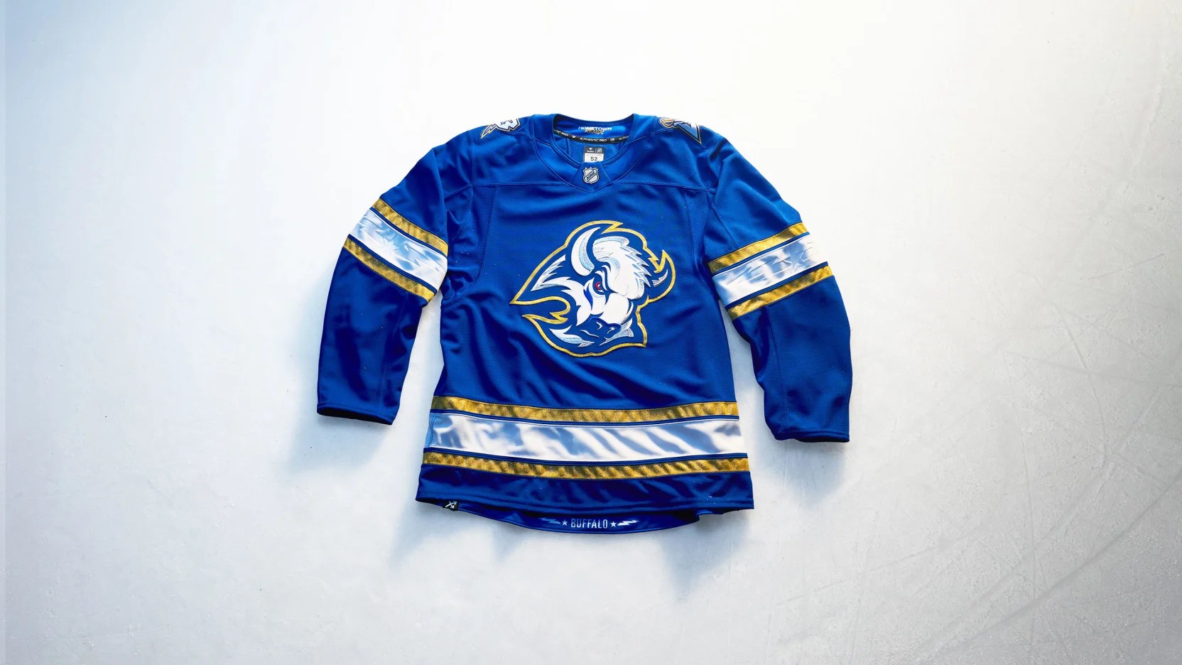
It’s just kind of plain, isn’t it? A perfectly acceptable specialty jersey.
Is it better with a nameplate and numbers? Sure. Is it better than any of the other renditions of the goat head? Not really.
The best goat head look is the original goat head look in black, white, red and silver. Speaking of silver, I almost wish the Sabres would’ve gone with something that’s actually more silver– their swords.
The 2000-06 alternate jersey got the Reverse Retro treatment in the 2020-21 season, but that’s not the sword logo I’m looking for.
No, I’m looking right at the ones on the shoulders of this jersey. The B with a sword (sabre) through it– and this time it’s electrified.
I’ve always wondered if the sabred-B would look good on the crest of a jersey and this template seems like it would’ve made a good one.
Call it a “missed opportunity” or “wasted potential” and dock a few points for effort. Other than that, it’s fine and I’m sure Sabres will love it regardless.
Effort: 7.5
Creativity: 5.0
Nostalgia: 8.9
Remix: 9.0
Total Score: 30.4
Calgary Flames
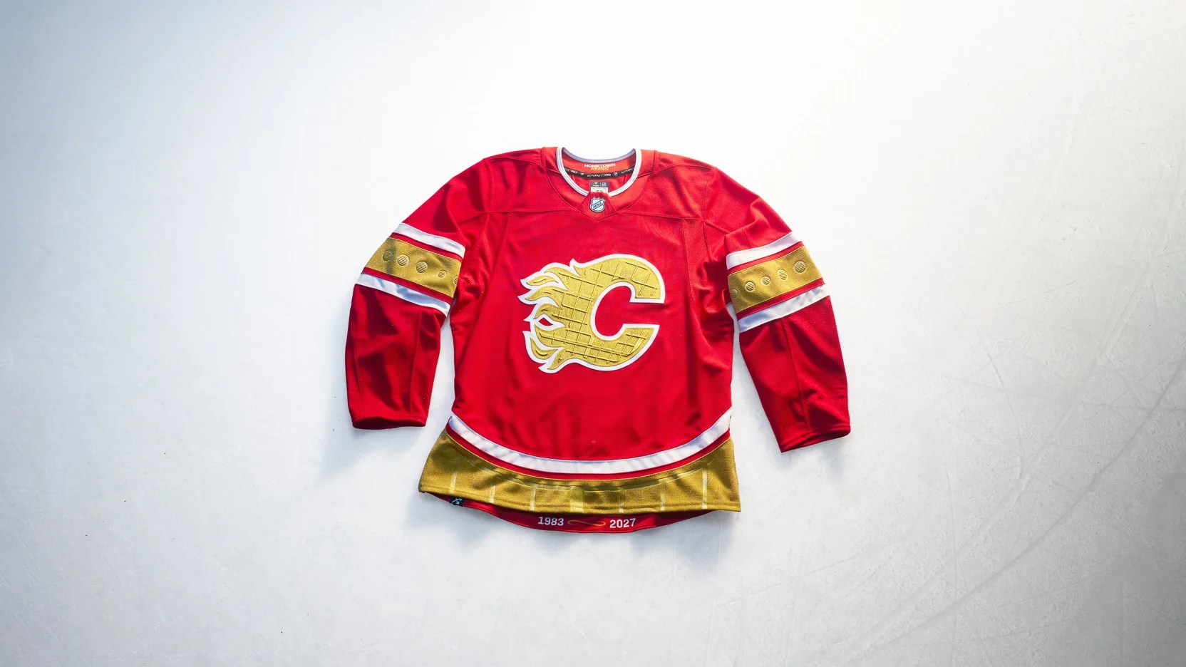
It’s good to see someone’s honoring the Acadie-Bathurst Titan. What? You mean this jersey is actually honoring the final season of Calgary Flames hockey at Scotiabank Saddledome?
That works too.
Calgary already hit it out of the park by bringing back their 2003-07 look for four more nights this season.
This jersey doesn’t move the needle one way or another for me, but it is at least 1) different and 2) in the spirit of whatever the Hometown Remix is defined as (incorporating jersey elements reflective of the local market– in this case, the arena itself).
Blasty’s gone to a farm upstate for the time being, but they’re building a new stable to welcome him home in another year when the next era of Flames hockey beckons for another nostalgia-fueled run.
Good work, Calgary!
Effort: 10.0
Creativity: 7.0
Nostalgia: 9.5
Remix: 9.0
Total Score: 35.5
Carolina Hurricanes
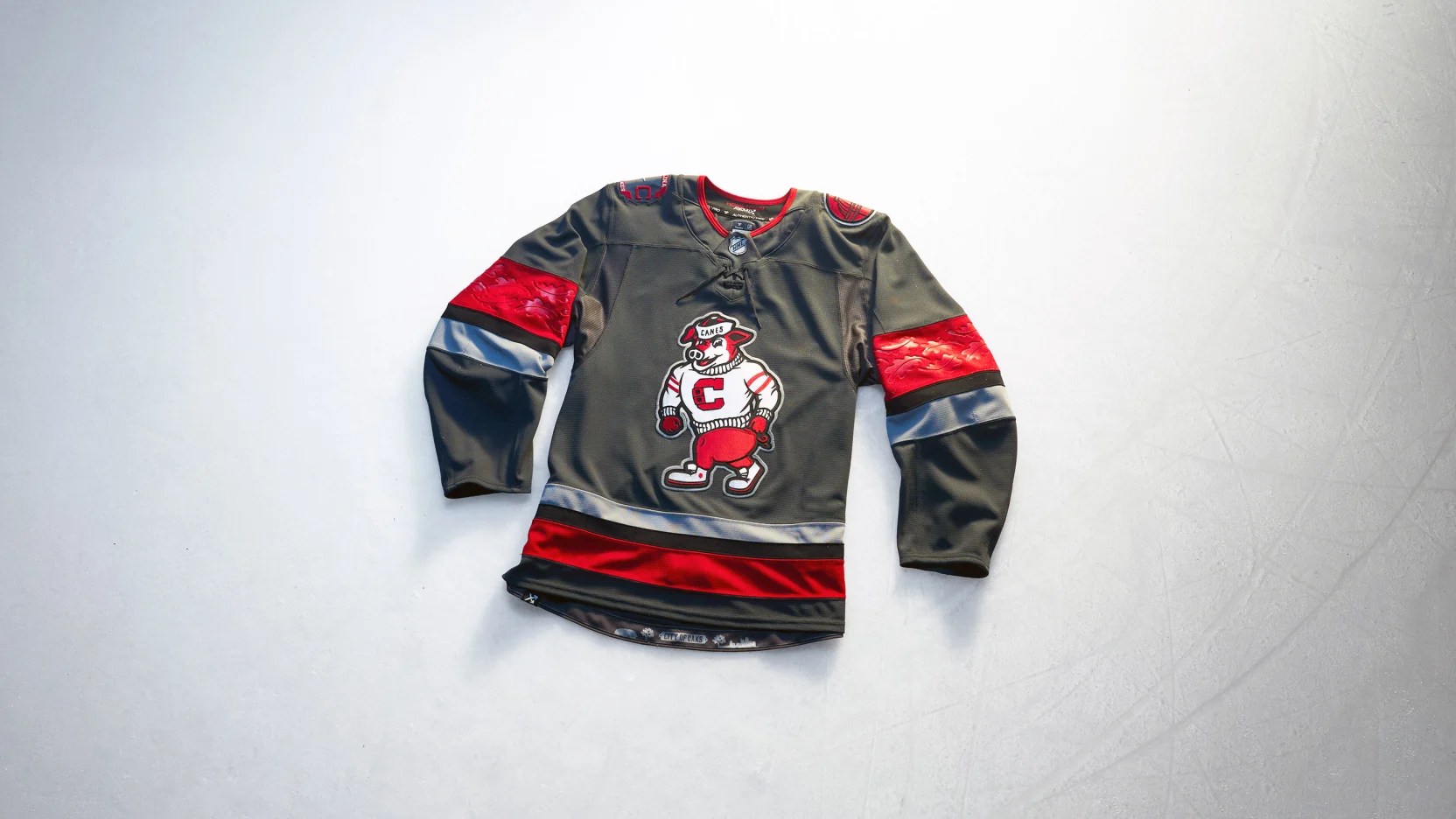
People give the Carolina Hurricanes a lot of flack for having a brand identity that’s consistently inconsistent across the board, but this might be the best jersey they’ve made since relocating from Hartford.
Unfortunately, given the timing and limited edition run, the Hurricanes have also fallen victim to Fanatics repeating the same basic template across multiple organizations.
Grey is a great differentiator from the rest of the league (well, normally, anyway) and the embossed oak leaves are fantastic in the sleeves. I almost wish the shoulder logos were acorns with a hint of a hurricane eye in them.
Everything about this jersey fits the “incorporates the local market” part of the Hometown Remix definition. The Triangle loves their Canes, college sports, tailgating, Red Oak and Storm Brew and I don’t blame them.
But if there’s one major takeaway from this that Carolina could learn from it’s that this striping pattern works and would create uniformity in the next era of Canes jerseys. Plus the number font is great too.
Stormy is a great alternate logo and is worth getting an extended look on a future third jersey.
How much heathering can you get on the torso of a jersey? I ask for future reference, especially if it’s grey.
Effort: 10.0
Creativity: 8.0
Nostalgia: 2.0
Remix: 10.0
Total Score: 30.0
Chicago Blackhawks
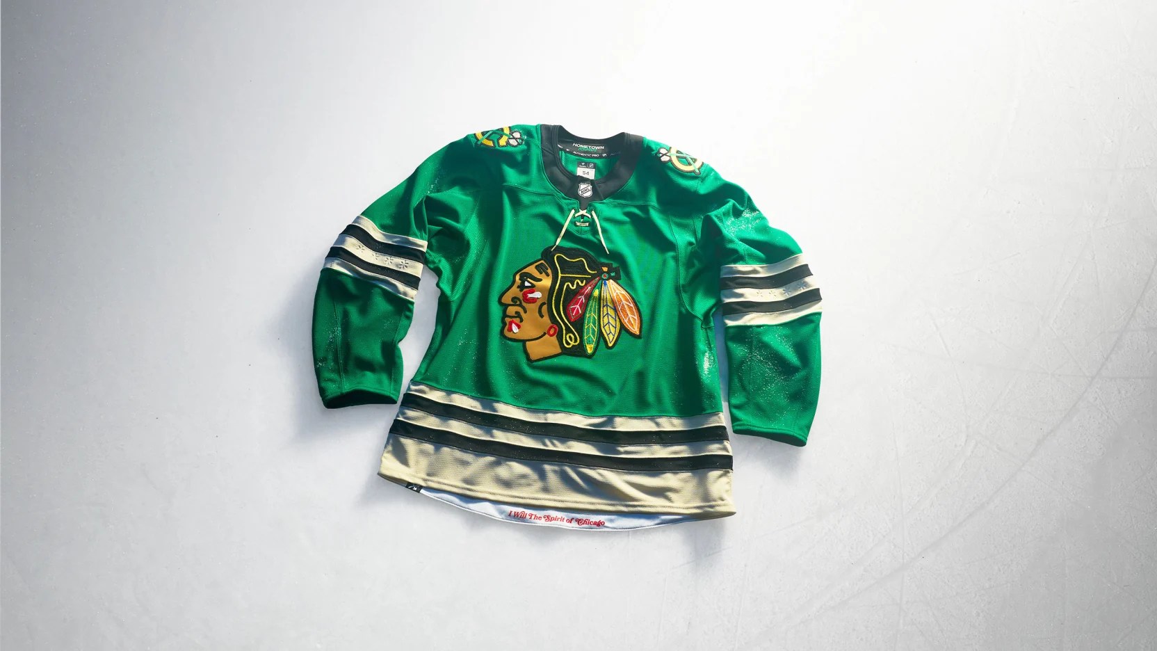
Happy St. Patrick’s Day!
Wait, it’s November?
If there was ever a case for the “do not do anything different with the main look and feel of Chicago’s jersey” crowd this is it. But in the spirit of Hometown Remix…
Why is it that Chicago is the only city that gets to be Irish?
It’s going to be jarring to watch the Blackhawks cosplay as the Dallas Stars when they wear these. Then again, isn’t it just the other way around normally, kind of? The Stars’ regular striping pattern is technically different. Technically.
I guess if we’re getting specialty jerseys like this in-game, we shouldn’t have any problem bringing them back to warmups league-wide, right?
Effort: 1.0
Creativity: 6.0
Nostalgia: 3.0
Remix: 10.0
Total Score: 20.0
Colorado Avalanche
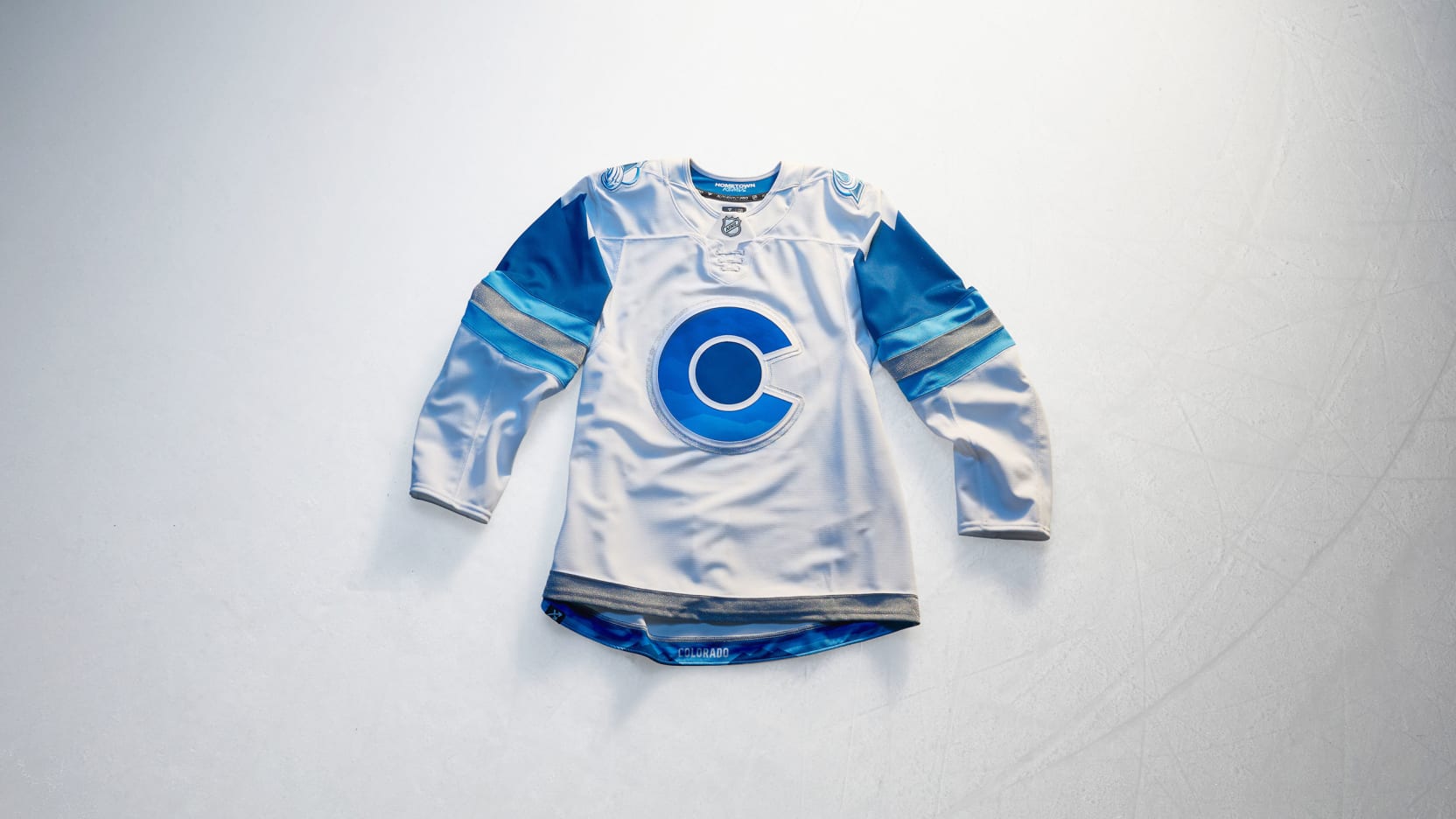
Without the rest of the uniform, this looks far too subtle to be that cool of a jersey. Did you notice how the sleeve stripes form mountains? Wait until you see the sublimated mountains in the crest and the numbers!
Also, there’s no burgundy whatsoever in the entire look.
The silver elements sparkle and the primary logo fades into the background on the shoulders. The Avs are opting to go with blue gloves instead of white because they don’t want to invoke whiteout conditions– they’re the Avalanche, not the Blizzard after all.
What do you mean they’re going for a whiteout look? O.K., fine!
The only element I wish Colorado would deviate from someday is the state flag “C” just for the sake of seeing what creative minds have to offer.
This jersey is heavy on the remix factor, though as for the hometown components it seems as though the Avs are just saying “we play in Colorado– where it snows. Bet you didn’t know that.”
Nonetheless it’s going to standout in a sea of black and grey Hometown Remix jerseys.
Effort: 7.5
Creativity: 9.4
Nostalgia: 1.0
Remix: 10.0
Total Score: 27.9
Columbus Blue Jackets
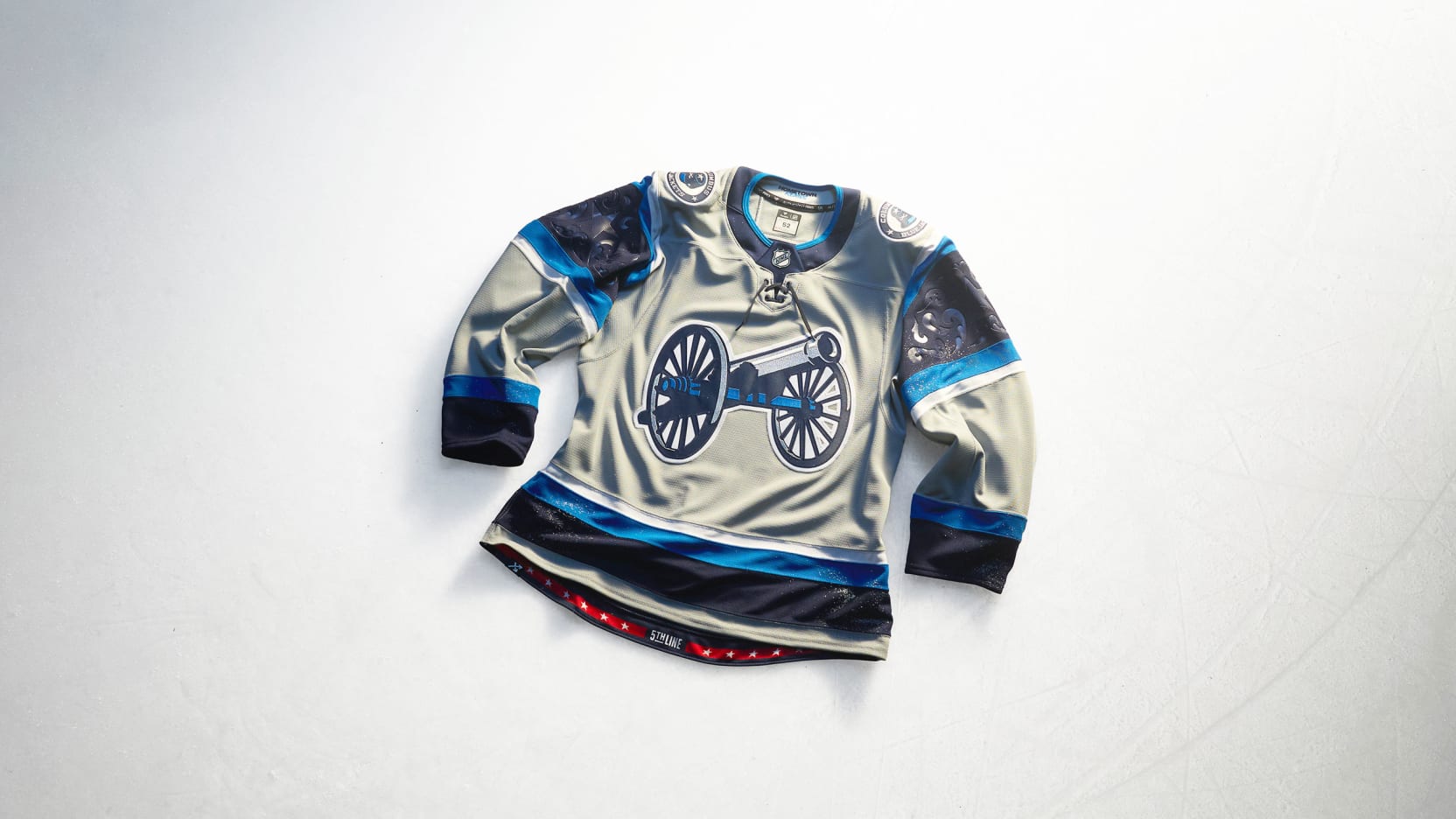
Are we in an alternate timeline where the Union lost?
As much as I hate to admit it, the Columbus Blue Jackets could use a rebrand. It’s time.
They’ve been around for almost 30 years now and they’ve only made it out of the First Round of the Stanley Cup Playoffs once– and we’re fast approaching the 10th anniversary of their 2019 Second Round appearance.
Sometimes the only thing that can get fans and players excited about the future is a well-executed refresh. Throw out the old losing image and build a new identity as a team on the rise.
The cannon should be canon.
As for this jersey itself, there’s a lot more to desire. It meets the requirements, but knowing there’s more on the table leaves a bad taste in the mouth until the thirst is quenched.
Effort: 6.5
Creativity: 6.0
Nostalgia: 2.0
Remix: 8.0
Total Score: 22.5
Dallas Stars
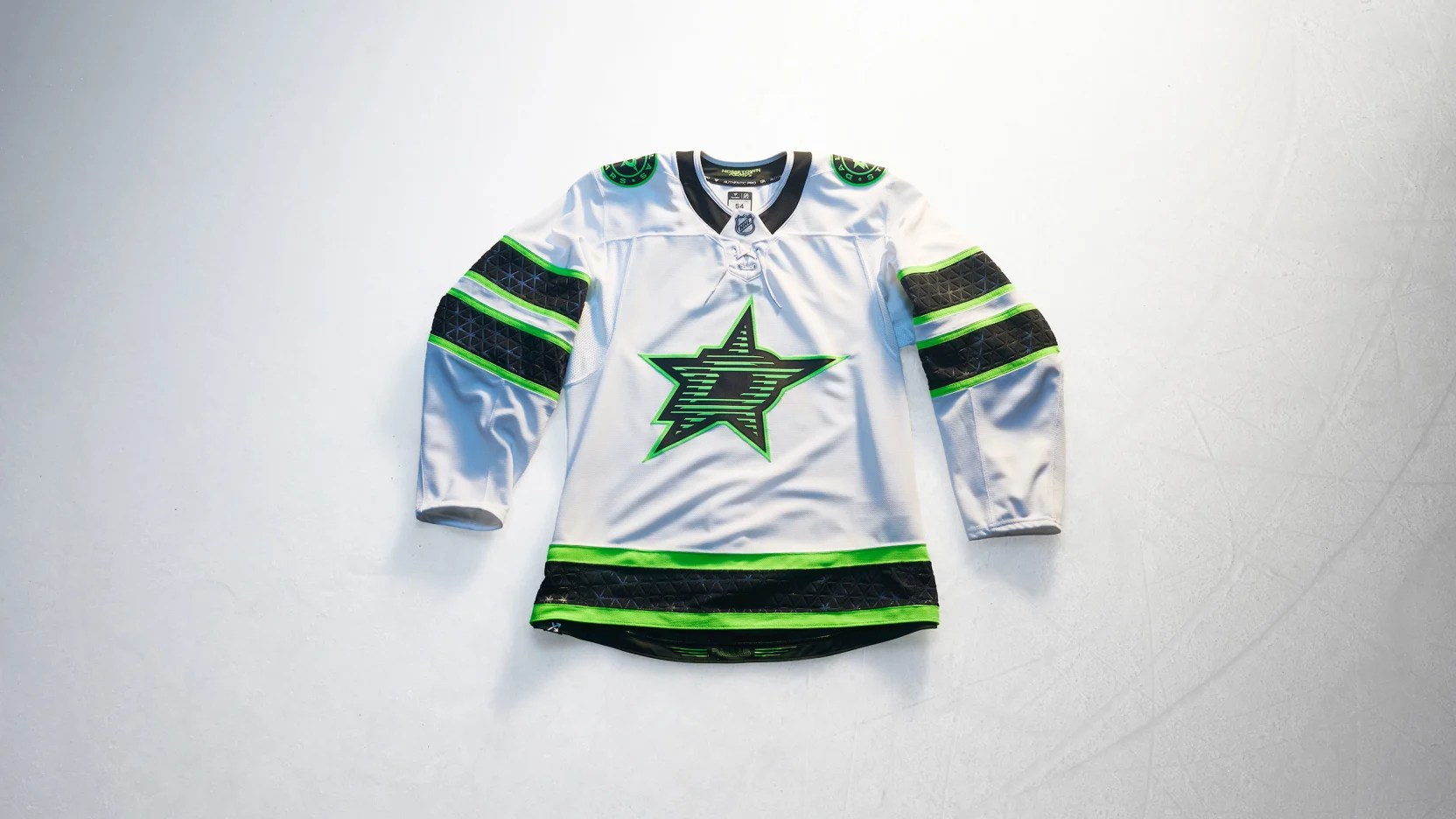
The Dallas Stars aren’t the only team guilty of this (Montréal did it in a monochrome format too), but why does the crest look like its wearing shutter shades that were popular in 2008?
If you’re looking to break free from the allegations that your home and road uniforms look too much like the Chicago Blackhawks, then this striping pattern could work in concept.
Not exactly like this (obviously change the colors), but if the Stars are looking to freshen things up since their 2013-14 rebrand at all– it’s not a bad direction to explore.
When it comes to “Hometown Remix” however, this jersey screams “specialty practice jersey” and that’s a pretty big swing and a miss for something that’s supposed to be fun and cool.
Mikko Rantanen will look great in it anyway.
Effort: 4.0
Creativity: 4.0
Nostalgia: 0.0
Remix: 2.0
Total Score: 10.0
Detroit Red Wings
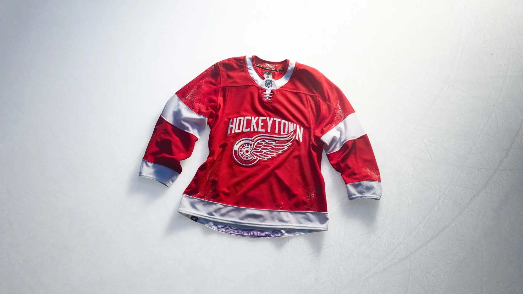
The Detroit Red Wings consider any and all changes to their look to be blasphemous and for once introduced something that’s not bad in a limited edition run (but not great either).
If we’re looking to gear Hometown Remix designs more towards younger demographics as an entry way to the sport, then incorporating some Al the Octopus elements in the sleeves would’ve gone a long way instead of just the hem of the jersey.
Imagine some embossed tentacles in the upper white stripe on the arms. I’m sure you might have to fight the Seattle Kraken for the right to do it though, but you’re the Red Wings– you were here first!
I can’t picture this jersey making an appearance in a Ferris Bueller’s Day Off reboot, but my friend Cam is probably going to get one of these anyway. Just don’t “Larkin” on the back.
Or do when they get discounted whenever Dylan Larkin is finally traded. Your wallet can thank me later.
Effort: 3.0
Creativity: 3.0
Nostalgia: 8.3
Remix: 4.5
Total Score: 18.8
Edmonton Oilers
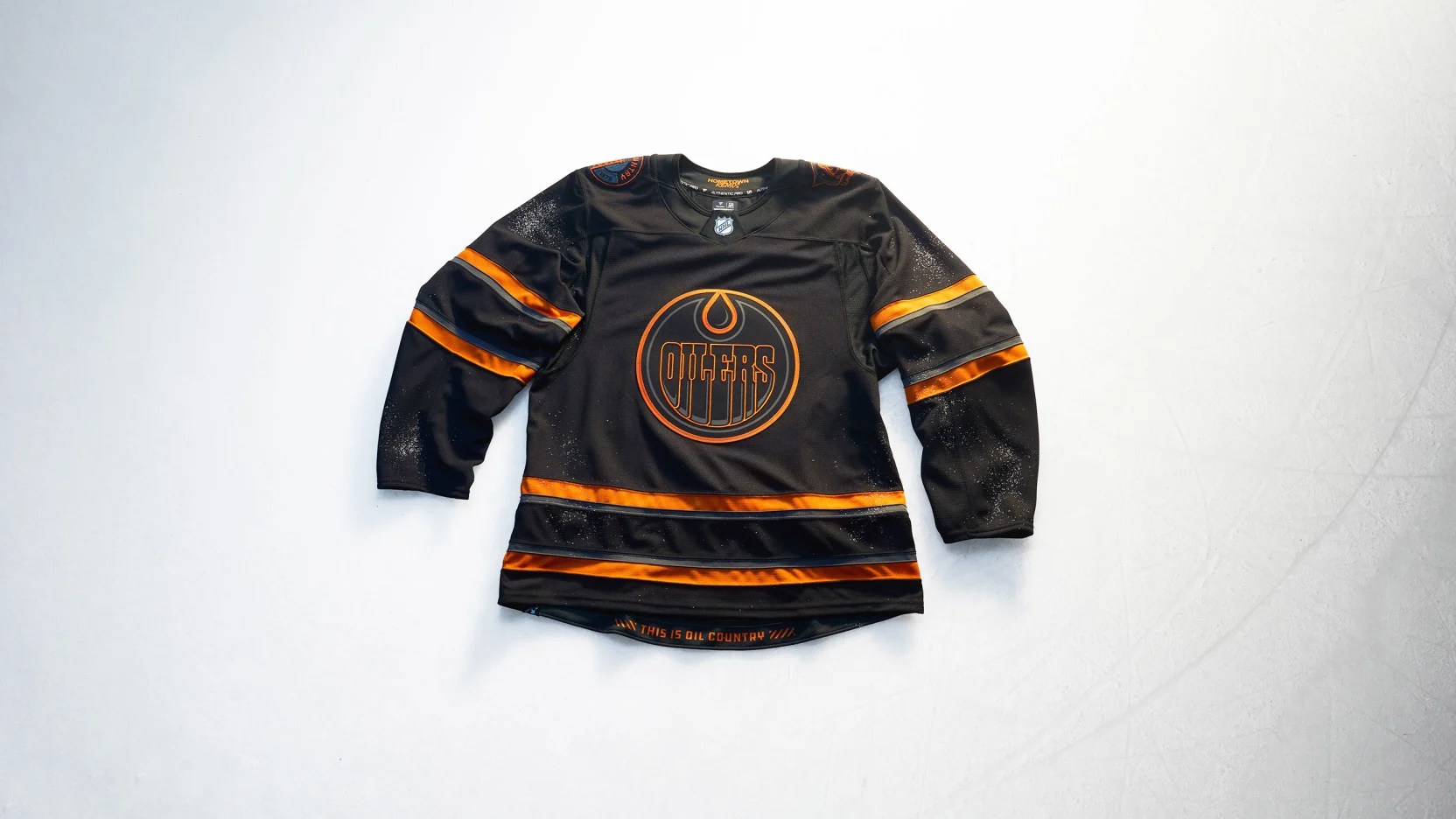
Look, I get everyone is nostalgic for the best time period of Edmonton Oilers hockey– 2006, obviously, shoutout Ryan Smyth– but what are we even doing here?
Sure, there’s a few logos featured on this jersey to choose from and arguably Edmonton should’ve picked either of the ones that’s not their primary logo. That would’ve at least been a step up from this ode to Halloween, clearly.
Oh and the numbers? They make it worse for everyone involved. Good luck determining who anyone is that’s not named Connor McDavid. At least with McDavid you can usually tell who he is on the ice because he just takes off from everyone else.
Well, that and he doesn’t come out of the room to accept his MVP trophy after the inevitable series loss, but I can’t blame him when his teammates are, well, who they are besides Leon Draisaitl.
Effort: 2.0
Creativity: 4.0
Nostalgia: 6.5
Remix: 2.0
Total Score: 14.5
Florida Panthers
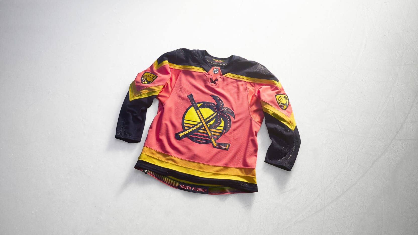
At first glance you might think, “wow, it’s cool that the Florida Panthers are wearing pink,” but then you might also think “wow, this a real missed opportunity for a sick Miami design or potential Stadium Series collaboration with Grand Theft Auto VI.”
Do we love the faux-80s look? Yes! Am I sick of the numbers being relegated to the shoulder yoke on every Panthers jersey nowadays? Also yes!
Did it drive me crazy when people said “this will be the first time a professional men’s team has incorporated pink in their uniform in any of the four major North American professional men’s sports!”– because it did drive me crazy, as a matter of fact.
What, do the Worcester Worcesters mean nothing to you?
Sure, the Worcesters wore “ruby” instead of “pink,” but they also recorded the first perfect game in the major leagues, so there’s that.
It’s hard to differentiate the orange and yellow outside of the crest, but overall it’s just unfortunate that Florida won back-to-back Cups in their current home and road jerseys. This Hometown Remix aesthetic would’ve been the perfect springboard for a rebrand to the inaugural template.
You can keep the Panther shield logo, even. Just bring back this stylization for the rest of the jersey. Then if you want a third and fourth jersey, use the light blue Reverse Retro 2.0 and this.
Effort: 7.0
Creativity: 9.0
Nostalgia: 9.0
Remix: 10.0
Total Score: 35.0
Los Angeles Kings
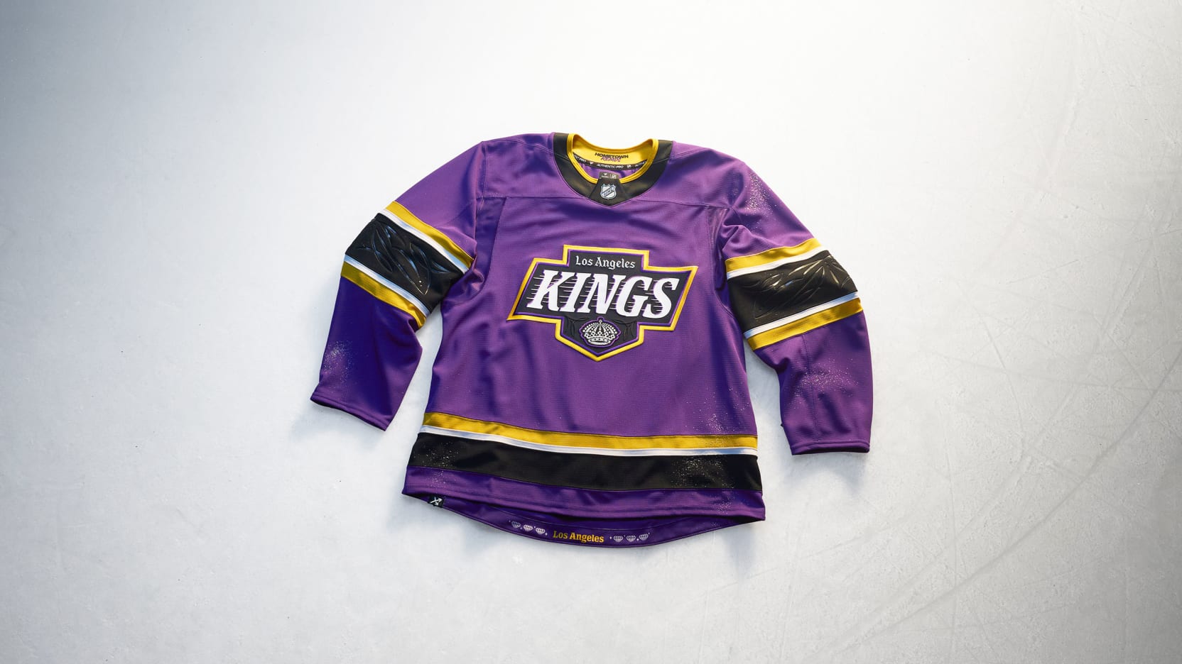
It’s criminal that the Los Angeles Kings haven’t gone back to utilizing purple– sorry, “Forum blue”– in some capacity on a regular basis.
I’ll admit this mashup from every era of Kings hockey is a bit much, but that’s also kind of the point of the Hometown Remix program so that helps significantly towards Los Angeles’ total score.
It’s a shame Anže Kopitar retired at the end of last season, because he’d look amazing wearing one of these on the ice.
Other than that, the Kings know what they’re doing. Both in the “solid effort” department and in the “they’re teasing us, aren’t they?” department. Please, I beg of you, bring back some “Forum blue” in a full-time alternate jersey– even if it’s just an outline in the numbers and a small stripe somewhere else.
Effort: 8.0
Creativity: 8.0
Nostalgia: 10.0
Remix: 10.0
Total Score: 36.0
Minnesota Wild
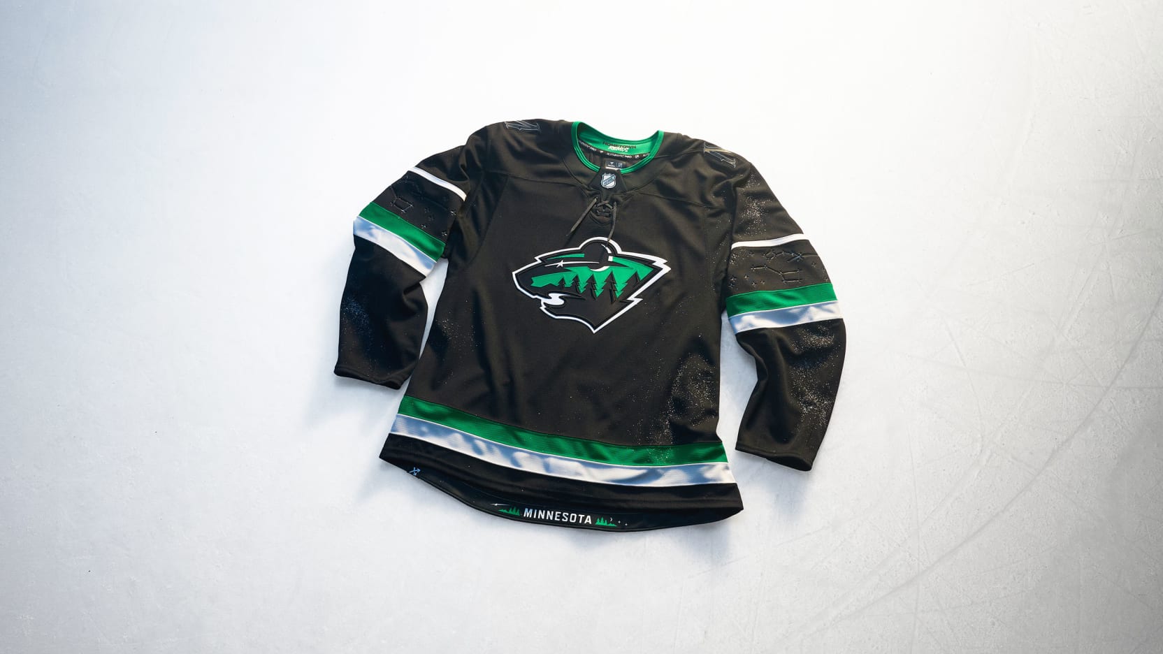
This Minnesota Wild jersey is out of this world! No, really, they sent it to outer space. Looks like they attached it to a weather balloon or something. I’m not a rocket scientist.
Overall, I like that the Wild are embracing the wild. The hint of a gradient on the sleeves and a touch of “remember the North Stars?” helps make something modern and chic in an otherwise nostalgia obsessed (about their ex) market.
Additionally, Minnesota did well by juxtaposing black and green in the number font to aide the viewers in-person, at home and up in the press box in identifying whether Kirill Kaprizov has the puck or whether or not Quinn Hughes is anywhere near a sheet of paper with a pen in his hand. It’s phenomenal, really.
Nice work, Minnesota!
Effort: 7.5
Creativity: 8.5
Nostalgia: 4.5
Remix: 10.0
Total Score: 30.5
Montréal Canadiens
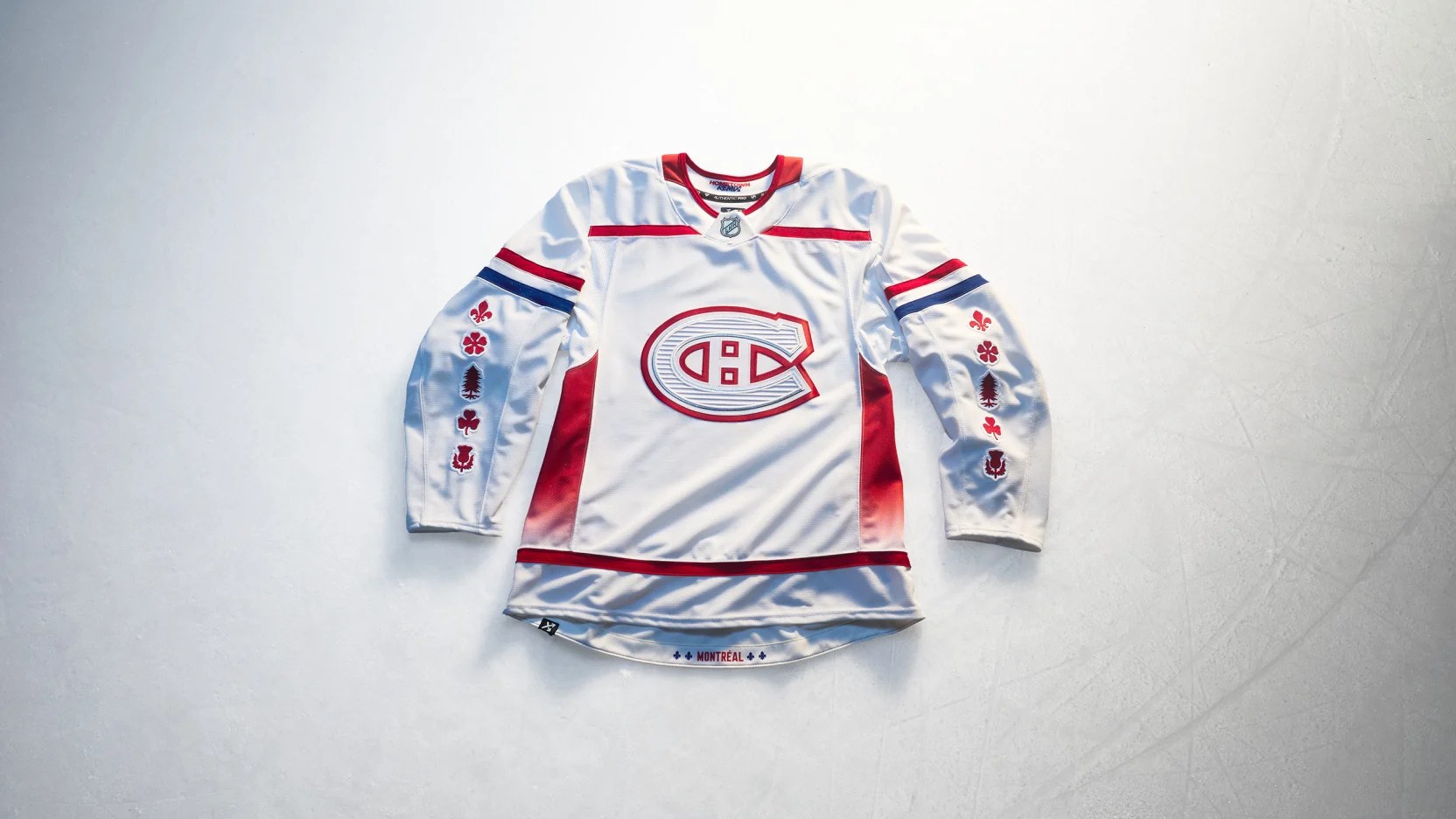
The Montréal Canadiens took a rare unconventional, nontraditional approach and made something cool.
It’s perfectly acceptable for a one-off. Please never do it again so it’ll retain some of its uniqueness when spotted in the wild.
That said, the symbolism is fantastic and gives credence to future third jersey concepts in case the Canadiens dare to explore adding a regular third jersey to their rotation.
There’s something special about seeing Montréal wear white on home ice a few times a year and thinking back to the 2006-07 season, for example, this jersey could look a lot better with the crest from that throwback alternate or the modern logo without any monochrome elements added.
And that’s where the Habs get points off. The full uniform is, well, certainly remixed from the usual and the monochrome crest just doesn’t do anything for me.
Effort: 7.0
Creativity: 10.0
Nostalgia: 1.0
Remix: 8.0
Total Score: 26.0
Nashville Predators
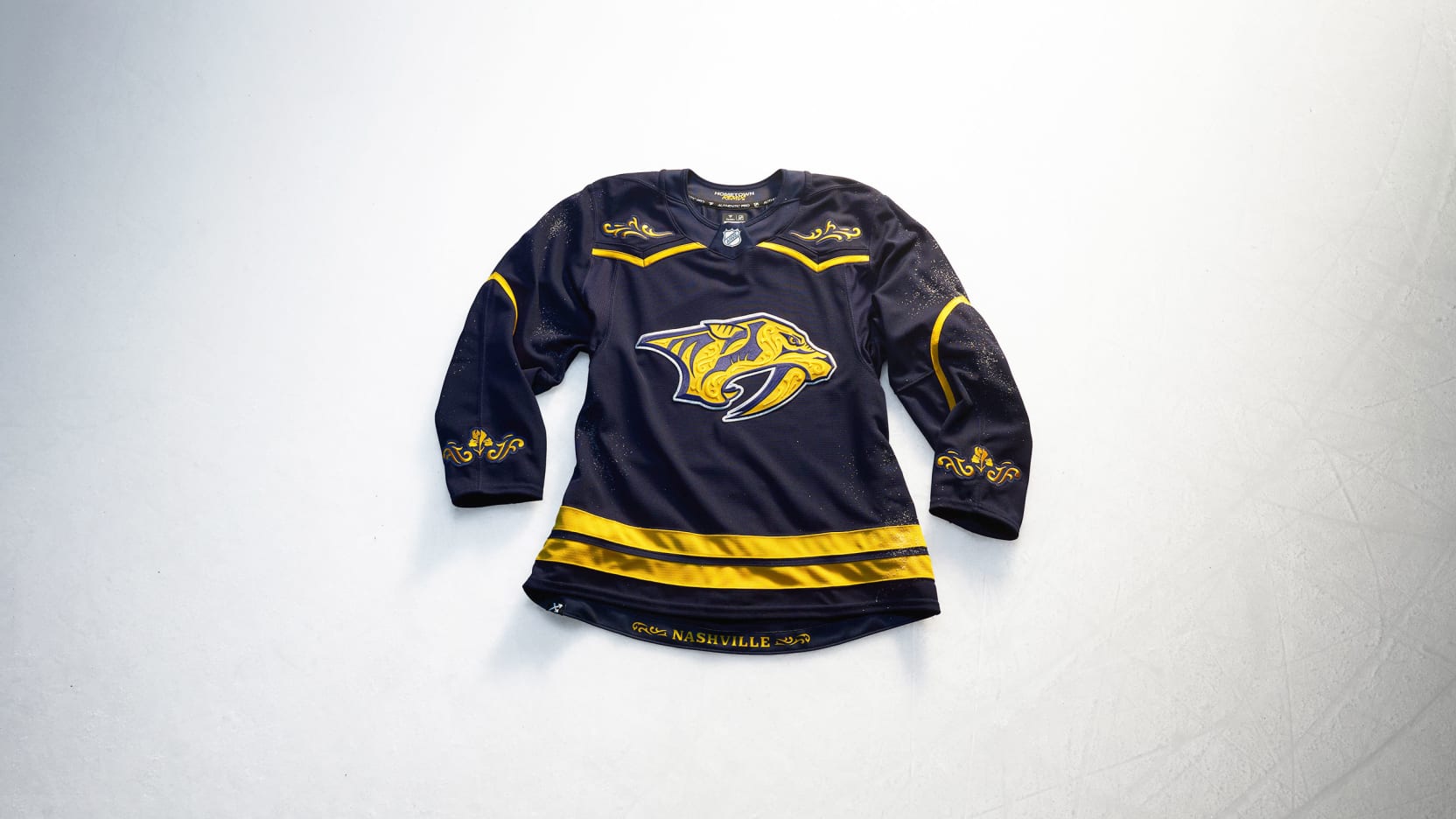
On its own, this jersey doesn’t warrant much attention. As part of a full uniform, this jersey is exactly the type of direction the Nashville Predators should explore for the basis of their next home and road uniforms.
Keep the frill for an alternate jersey, but imagine what a home uniform with this striping pattern and a little more white could look like?
Or, fine, if you want to keep marigold as your primary color, invert the design of this jersey, swap the crest with the regular logo and try telling me it’s not better than what they currently wear.
Seriously, I’ll wait.
And while we wait, we might as well stroll down Broadway wearing one of these.
Effort: 10.0
Creativity: 9.0
Nostalgia: 3.0
Remix: 10.0
Total Score: 32.0
New Jersey Devils
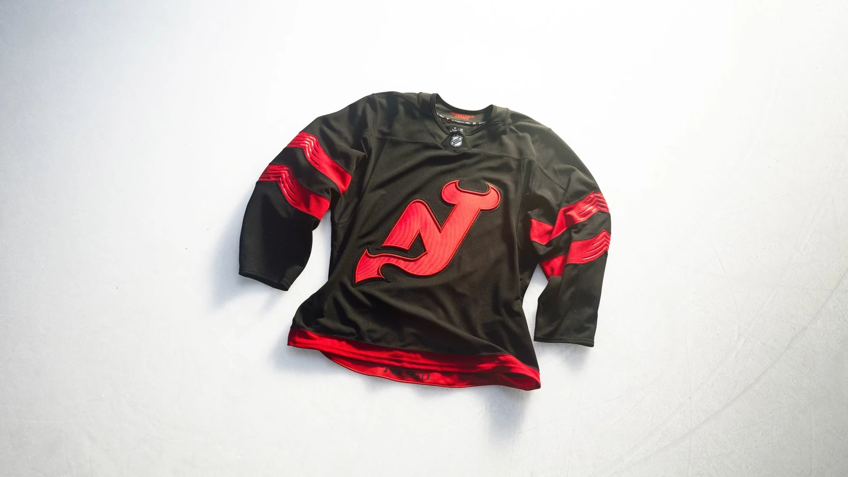
Love it or hate it, the “Jersey” jersey was a good thing for the New Jersey Devils organization because it gave rise to the notion that 1) the Devils could pull off an alternate jersey after all and 2) that it wouldn’t actually be that hard if they wanted to make a good one in black.
Then the 2024 Stadium Series happened and while the reduced color scheme looked cool, it left fans and jersey collectors alike wanting more.
Everyone knew that if you inverted the 2024 Stadium Series jersey, you’d have something that would fit right in with the heart and soul of the Devils without being quite an affront to the diehard fans like the 2021-26 alternate jersey was.
But as a Hometown Remix, it sucks knowing that this will go back in a vault after this season only to return when New Jersey needs to print more money.
Inevitably, the Devils will regress to the established norms of safety and security in the simplification of a two-jersey system– home and road and nothing more– not daring to be bold, despite leaving Lou Lamoriello in the past many years ago.
Effort: 3.0
Creativity: 8.0
Nostalgia: 0.0
Remix: 10.0
Total Score: 21.0
New York Islanders
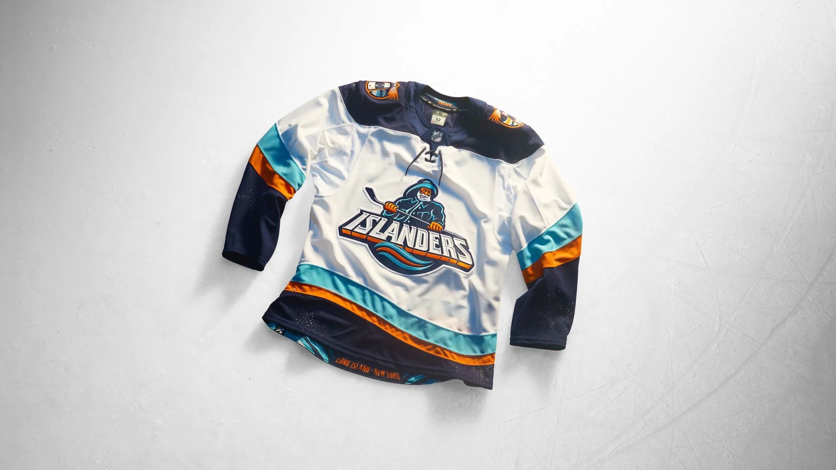
The New York Islanders re-used one of their past assignments and re-submitted it. Again.
That’s kind of lame, even if we want fish sticks. What’s worse is that you can now own a full set of home, road and alternate fisherman uniforms that if the Islanders really wanted to– they could wear all the time again like it’s the 1990s, but no they don’t want you to have fun like that.
What a shame.
Effort: 1.0
Creativity: 1.0
Nostalgia: 10.0
Remix: 0.0
Total Score: 12.0
New York Rangers
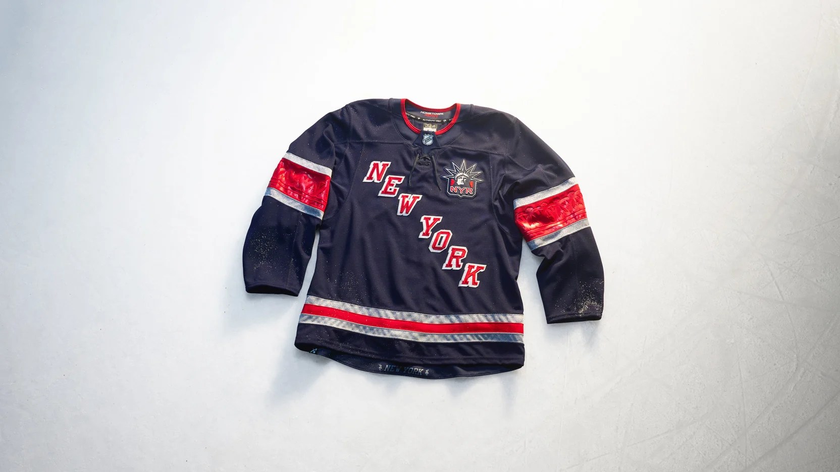
Speaking of New York teams, did the New York Rangers make an effort either? No, not really.
Sure, Lady Liberty is on the front of the jersey in a different way than ever before and it says “New York” on the front instead of “Rangers” like how it did at one point in time in franchise history.
There’s some funky sleeve stuff and… …not much else. Oh and silver, I guess. That’s cool.
Effort: 1.5
Creativity: 2.0
Nostalgia: 7.0
Remix: 0.5
Total Score: 11.0
Ottawa Senators
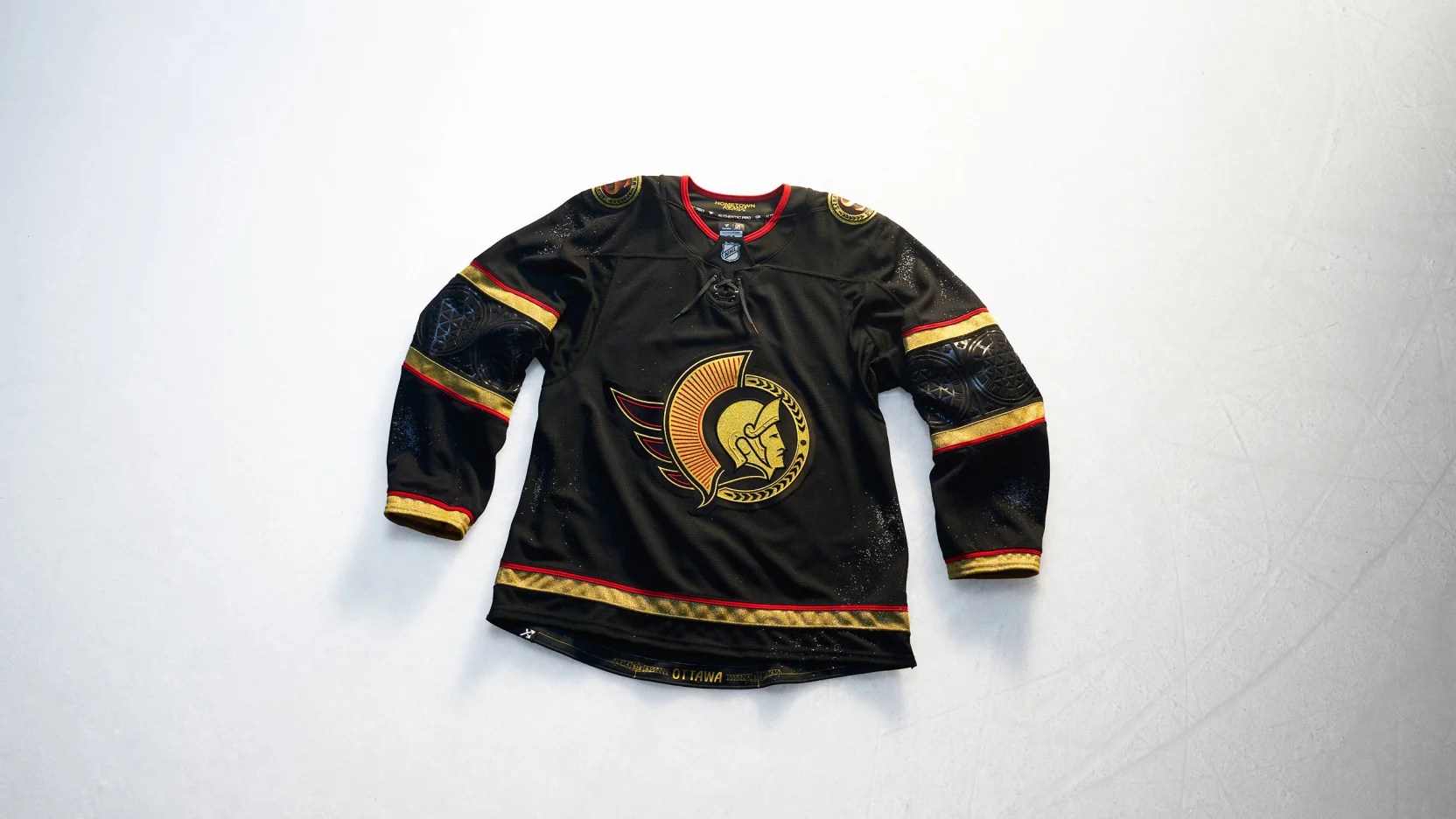
If the Ottawa Senators want to emphasize gold so much, why don’t they just make a gold jersey? Especially since the Vegas Golden Knights cracked the code on how to make one. Sure, that one doesn’t look good, but Ottawa’s would.
At least it’d be better than whatever this is. I don’t hate it per se, but I don’t love it either.
It’s yet another classic example of why you really need to include the number font and design in marketing material when revealing the jersey (you know, like how the NHL and Fanatics overlooked doing so above).
On the ice, it looks better than it’s advertised, but it still feels like a fashion jersey and nothing more.
Effort: 2.0
Creativity: 6.0
Nostalgia: 8.0
Remix: 5.0
Total Score: 21.0
Philadelphia Flyers
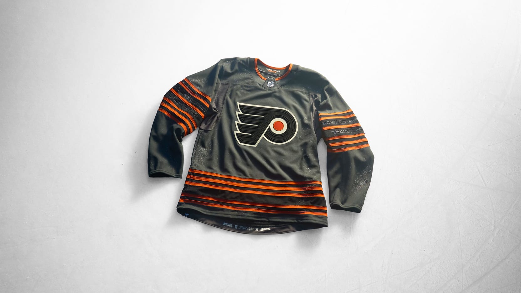
If the Philadelphia Flyers wanted to make a cool jersey based on their 2012 Winter Classic jersey, they’d recreate that but in grey like this. Instead of the regular crest, they’d slap the Liberty Bell logo that we’ve seen advertised with this Hometown Remix on the front instead of just anywhere but the jersey itself.
Sure, the striping pattern may be a little busy, but there’s a lot of great elements to work with here that– like with the Carolina Hurricanes– would’ve made an impressive third jersey option as something truly different from the rest of the league.
Unfortunately for the Flyers, there’s a lot of grey and black jerseys in this batch of Hometown Remix jerseys.
Effort: 7.5
Creativity: 8.0
Nostalgia: 3.5
Remix: 8.0
Total Score: 27.0
Pittsburgh Penguins
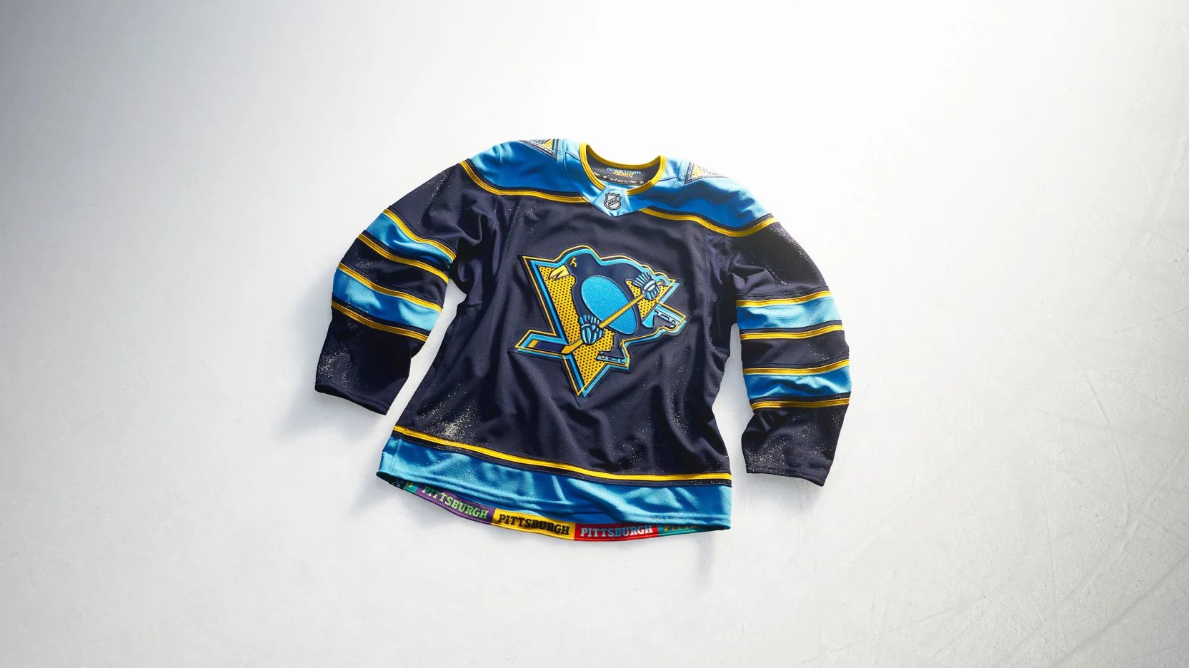
Everyone freaked out when they saw poor mockups of this jersey and now everyone’s freaking out because they’re selling out and they can’t get new ones in fast enough (or at all, because Fanatics says that once they’re gone, they’re gone).
Andy Warhol, pop art, the color yellow– Pittsburgh’s culture is on full display in this convergence of Penguins hockey history (past and present) and everything else that makes the Steel City, the Steel City.
It’s exactly what we want in a Hometown Remix jersey. Bold, (kind of) new and unabashedly itself. Even Sidney Crosby has to admit it’s good despite the fact he never wants to wear a blue Pens uniform.
Effort: 10.0
Creativity: 10.0
Nostalgia: 9.0
Remix: 10.0
Total Score: 39.0
San Jose Sharks
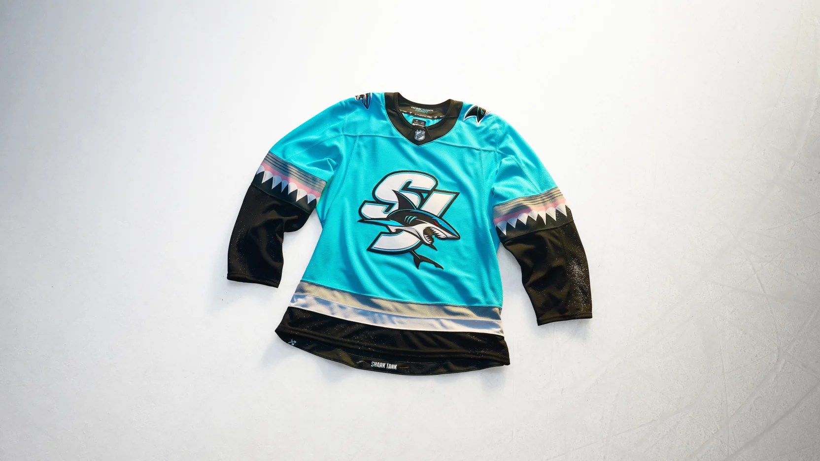
Sublimated teeth costs the San Jose Sharks– historically considered to be innovators in the jersey design process, what with their computer chip embossed sleeves on that one alternate jersey from years ago to the very basic design of their entire history of jerseys.
You’re telling me you couldn’t find a way to make the teeth three-dimensional?
That said, kids will like these and that’s really what it’s all about. The kids.
No, not Macklin Celebrini and Will Smith themselves, but sure, they’re close enough in age to that of those that love this jersey.
Effort: 8.0
Creativity: 9.0
Nostalgia: 1.5
Remix: 10.0
Total Score: 28.5
Seattle Kraken
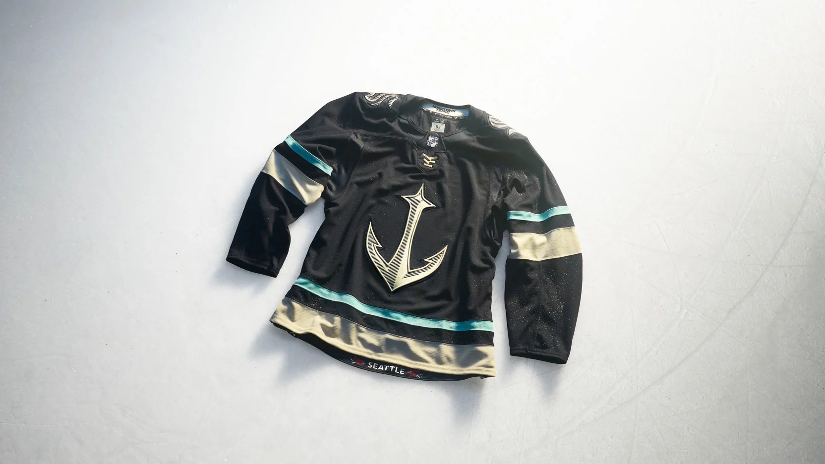
I have to admit that at first glance I thought “oh no, Seattle found a way to make their awesome secondary logo look mid,” but upon reflection this is a really well done visual representation of the U.S. Pacific Northwest.
If I were starting a team in Portland, Oregon, I’d “borrow” this basic template, slap a rose on the crest, coordinate the colors accordingly and call it a day. Unfortunately for my hypothetical Portland expansion team, the Kraken have already beaten them to it.
If I were made of money, I’d buy one of these.
I’d have a hard time picking a player though since my last Seattle jersey only went so well (I’m sorry, Joonas Donskoi). I wouldn’t want to bring that curse upon Joey Daccord.
Effort: 10.0
Creativity: 9.0
Nostalgia: 7.0
Remix: 10.0
Total Score: 36.0
St. Louis Blues
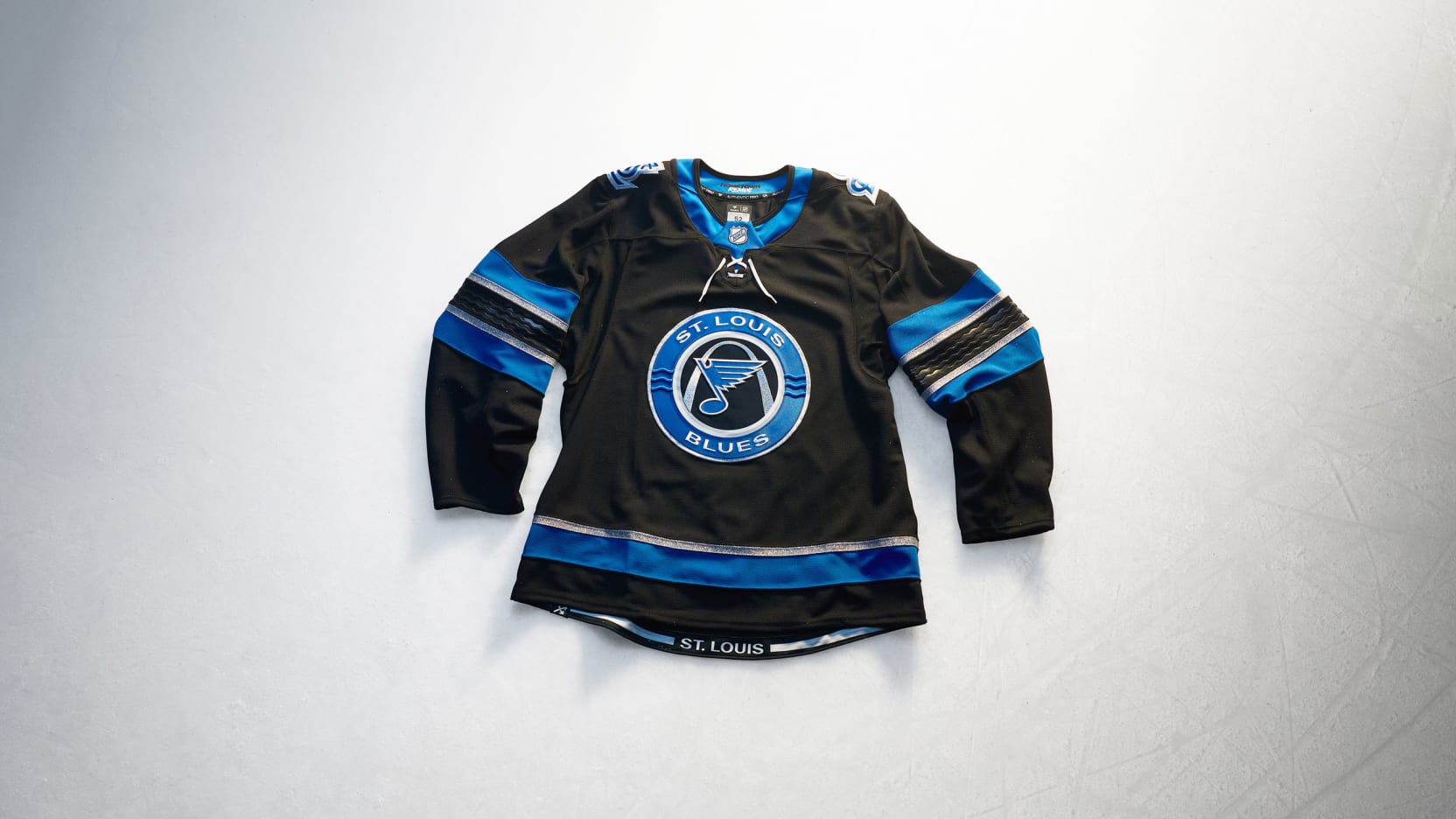
I’m in the minority here, I know, but I really like the St. Louis Blues Hometown Remix jersey. Sure, you could improve it with a pop of gold or by swapping out the black parts of the jersey with navy blue.
Or you can steer into the skid and appreciate the 2004-11 era Toronto Blue Jays vibes or maybe when you first saw this jersey you thought of the Tampa Bay Lightning anytime before their 2011 rebrand.
Either way, I like the name and number fonts, I like the Gateway Arch and I like the twist on the colors of the “STL” shoulder patch from its regular appearance in blue and yellow.
For being a Reebok Black Ice, Crosscheck and/or Accelerator jersey, this one is a pretty good one. No notes.
Effort: 7.0
Creativity: 6.5
Nostalgia: 4.3
Remix: 10.0
Total Score: 27.8
Tampa Bay Lightning
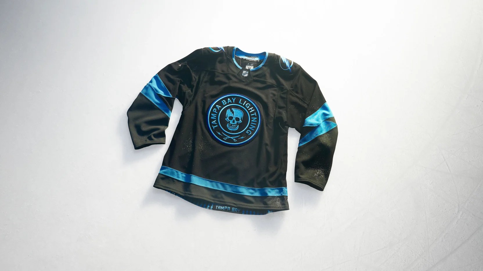
If only the Tampa Bay Lightning had these cool lightning bolt sleeve strips on their regular jerseys. Honestly, they could lean into the storm a bit more. Given how things are going on and off the ice, Tampa is bound to rebrand soon enough anyway.
There’s some elements that the Bolts have introduced between this jersey and their 2026 Stadium Series jersey that would make for a good foundation to build upon.
Two shades of blue? Absolutely need it if you want to differentiate yourselves from the Detroit Maple Lightning aesthetic that you currently have, Tampa.
That said, this is still another Reebook Black Ice, Crosscheck and/or Accelerator jersey template, so that’s at least, like 20 points off.
Effort: 3.5
Creativity: 8.6
Nostalgia: 1.0
Remix: 3.0
Total Score: 16.1
Toronto Maple Leafs
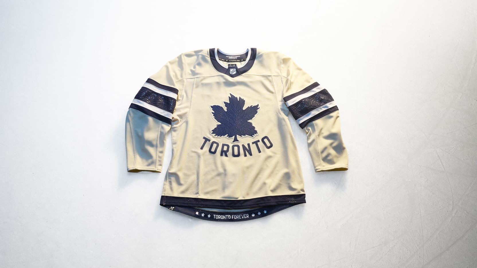
I don’t know how else to describe it, but if the two-tone vintage white and modern white thing that’s going on were any other place– like, say, the Titanic— it’d look like it belonged more.
That said, I don’t hate what the Toronto Maple Leafs are trying to accomplish here. I do, however, think of life vests or Houdini’s straightjacket or anything but a Leafs jersey when I see this.
I like the maple leaf crest itself, though. I could do without the city identifier, but I understand “Original Six tradition” or whatever.
It feels a bit criminal that they’re going to wear this jersey so much this season.
Effort: 4.0
Creativity: 6.0
Nostalgia: 10.0
Remix: 5.0
Total Score: 25.0
Utah Mammoth
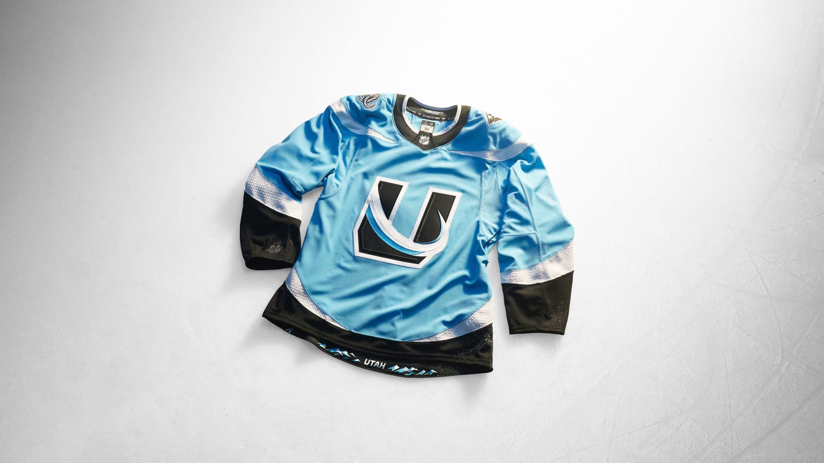
Did you notice the tusks on the shoulders?
I wish we could give the Utah Mammoth bonus points for that.
Everything about this Hometown Remix jersey makes an excellent third jersey, so please don’t just wear them this season. Please.
Does the fact that the Mammoth used the “U” logo for this mean that they’re leaning full mammoth body (with legs) for their Winter Classic look? Because that’d be wicked cool.
Effort: 10.0
Creativity: 10.0
Nostalgia: 3.0
Remix: 10.0
Total Score: 33.0
Vancouver Canucks
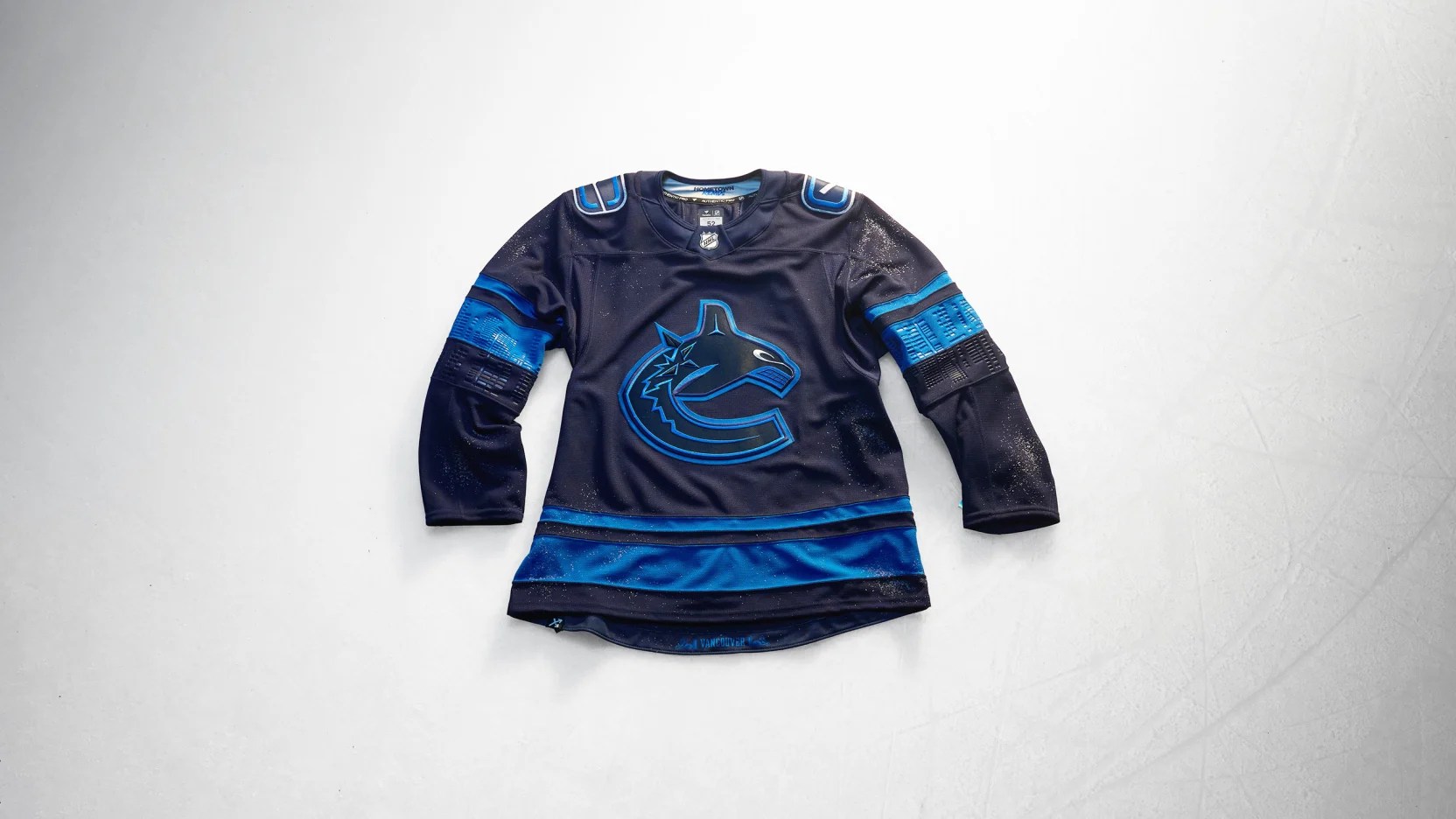
It’s not bad. It’s not the “Flying Skate” but in blue and it’s not the “Flying V” but in current Vancouver Canucks colors, so at least we avoided a complete nostalgic gimmick.
That said, this is a tad too dark and the numbers are going to be hard to differentiate. However, the city skyline and its reflection on the sleeves is tremendous touch.
But then again, there’s nothing new about this jersey. Same logos, same everything except for the color scheme.
Effort: 2.5
Creativity: 6.0
Nostalgia: 0.0
Remix: 3.0
Total Score: 11.5
Vegas Golden Knights
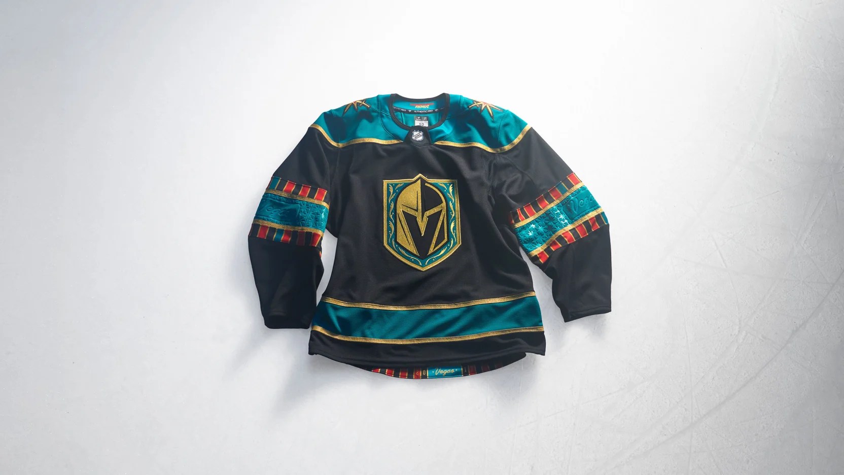
Yep, couldn’t name the team the “Aces” when the expansion effort was announced in 2015, but sports gambling was legalized since then so this casino-inspired look is totally fine.
The Vegas Golden Knights are, in fact, very Vegas.
Might as well throw a poker chip on the crest and call it a day. I’m surprised they didn’t incorporate any pink flamingoes on the shoulders too.
Effort: 4.0
Creativity: 4.0
Nostalgia: 1.0
Remix: 4.0
Total Score: 13.0
Washington Capitals
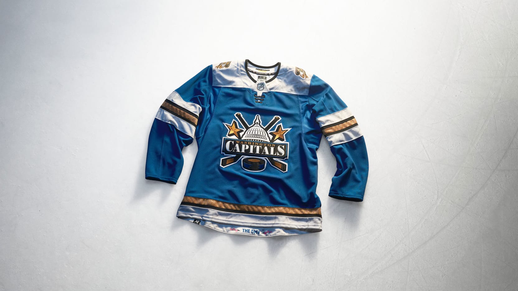
Once Alex Ovechkin hangs up the skates at season’s end (whenever that is), what direction will the Washington Capitals go for a rebrand and why won’t they stop spelling everything out?
This jersey harkens back to the Reverse Retro vibes of modernizing a classic, yet reinvents itself under the guise of a “remix.” There’s nothing wrong with that.
If the Caps opt to go teal in the post-Ovechkin era, can they do better than this Capitol logo? Can they make the screaming eagle palatable?
Do they take their current alternate and make it the basis of the next set of home and road uniforms or do they stay committed to producing some of the best alternate jerseys in D.C. sports history only to be paired with a home and road set that looks badly out of place in 2026?
Effort: 10.0
Creativity: 9.5
Nostalgia: 10.0
Remix: 10.0
Total Score: 39.5
Winnipeg Jets
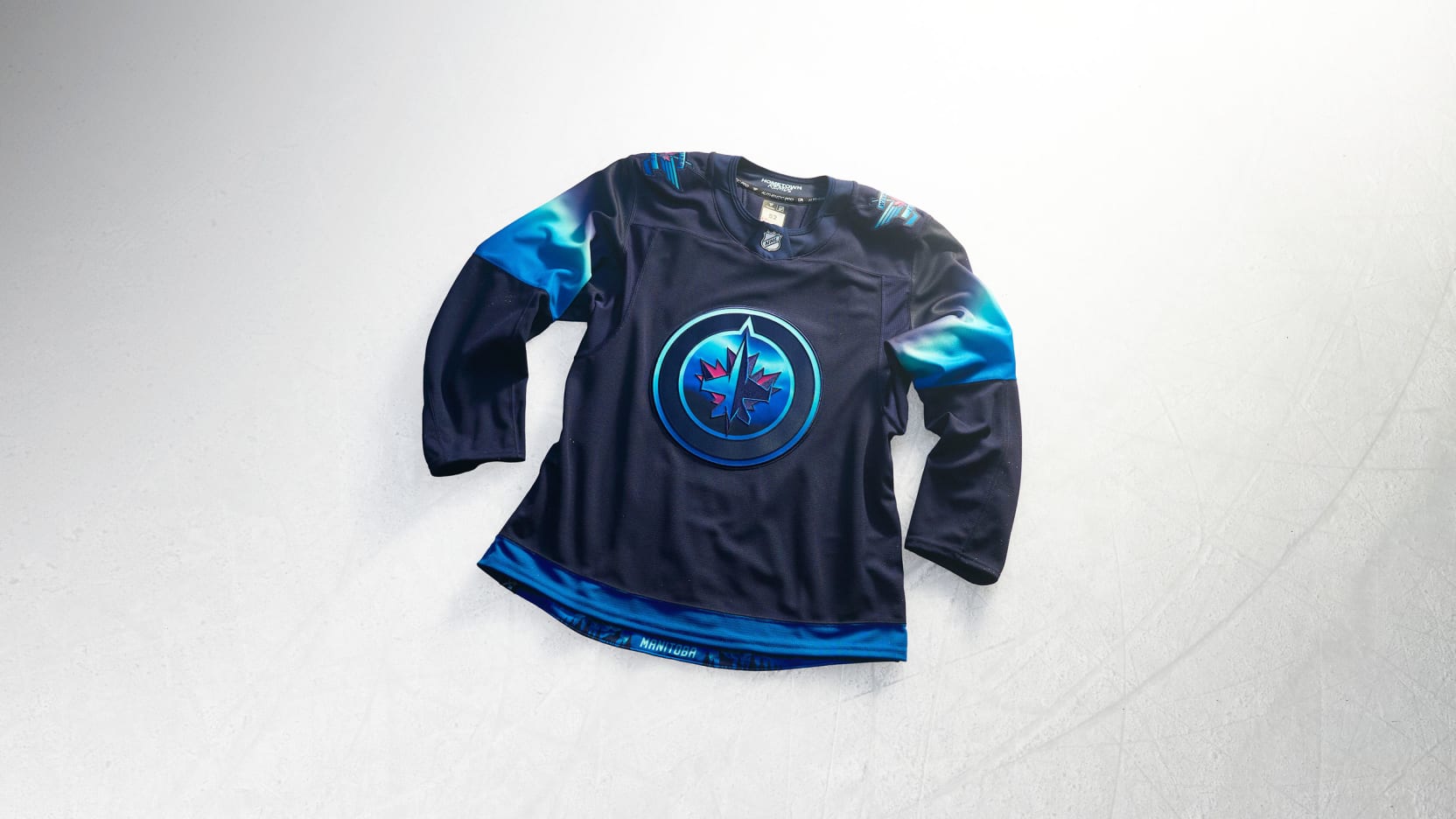
This would’ve been a sick Reebok Black Ice, Crosscheck and/or Accelerator fashion jersey had the Atlanta Thrashers relocated to Winnipeg prior to the release of most of the aforementioned Reebok fashion jerseys.
Or did I collectively push the Jets’ Reebok fashion jersey era out of my memory? Either way, whether or not they actually happened post-Thrashers, you’re getting them now under the Fanatics banner, Winnipeg!
There’s nothing wrong with a little gradient so long as it doesn’t leave more to be desired and, well, I crave something more.
Effort: 3.5
Creativity: 7.0
Nostalgia: 1.0
Remix: 3.0
Total Score: 14.5


Leave a Reply