By: Hannah Mixer
Colby’s Corner has been taken over this week! Since boys have no fashion sense, they invited a girl to write their fashion article on the World Cup of Hockey. My first opinion is that I find it interesting that we have a North American team in addition to the US and Canada. Seems silly to me, but not my place. On to the more interesting opinion: the fashion!
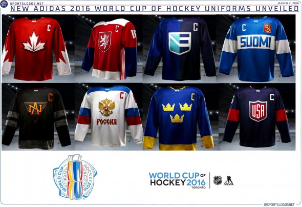
Canada’s jerseys are classically Canadian. The red and white are simple and classy, and the sleeves have the shape of the maple leaf (if you didn’t notice). For someone with little knowledge of hockey, Canada’s jersey was easy to identify. Grade: A.
Next is the Czech Republic. They incorporated their history by using the lion from their coat of arms, which originally symbolized Bohemia when they became the Republic. The red and white colors symbolize Moravia, and the final color, navy, also appears on their coat of arms, though I am not sure that it symbolizes anything. I like this jersey because of its historical content, plus the simple colors and design make it appealing to the eyes. Grade: A
The European jersey is not one of my favorites. My favorite color is a turquoise blue. The colors in this jersey should be appealing to me, but the design makes them less so. I do not like the color blocking that goes vertically down the middle of the jersey. I like the use of the hockey stick to create an E in the logo. Overall, I give it the grade of ‘ehh’. (But really, Grade: C)
Finland’s jerseys are slightly more appealing. Though I know I said I liked the horizontal blocking in the Czech Republic, this one, not so much. The colors are perfectly appealing, I just do not like the structure, personally. Suomi means “Our Land” in Finnish, and I think the use of this on the jersey is lovely. They also incorporate their crest, which I like. Grade: B+.
North America’s jersey is…interesting. It is very dark and very plain. The large NA makes it simple to identify. I like black and gray, and wear a lot of it myself, but I do not expect a hockey jersey to be so dark with hardly any accents. The Penguins and the Bruins have black jerseys, but they accent it with bright colors. Even the C on North America’s jersey is a dark, dull red. North America is such a bright and lovely place, their jersey should reflect that! Grade: B.
Russia’s jersey is a nice change from the previous three. Not my favorite, but I at least like it. A simple white with blue and red stripes on the arms. Again, use of a historical crest, and the shoulder stripe. Their C is sharply demarcated, whereas I prefer the softer, curved C. The only downside to this jersey is that blood stains white a whole lot easier than the darker colors. Let’s hope there are no fights! Grade: A-.
Sweden’s jersey is Colby’s favorite. Personally, I don’t think it’s bad, though Canada is still my favorite. I like the blue and gold, and the three crowns are the national emblem of Sweden. You know by now how I feel about incorporating history. This is the only jersey whose accented color on the sleeve ends at the wrist. I like this because the accent isn’t too large, like the Czech Republic, but more subtle. It feels more like an accent. The thin gold piping around the neck is lovely also. The perfect touch on the second best jersey. Grade: A.
Finally, we have the US jersey. I know that as an American, this jersey should automatically top my list, but sadly it does not. I expected more from us. Red, white, and blue are our colors, though the blue is not the same blue as is on our flag. In addition, the USA symbol is not at all historical or symbolic of us, besides the lettering. The red blocks in the elbow are nice enough, but again, just ehh. I’ll be nice and give it a B.
If you like the feminine perspective, give me a shout and I’d be happy to pop in from time to time and take over Colby’s Corner. Hannah out.

Leave a comment